Ensuring Browser Compatibility: Advanced Strategies and Tools

Browser compatibility is essential for a website to function perfectly on different browsers, devices, and platforms. Users who access a site from various environments expect a smooth experience without browser compatibility issues. Achieving this requires various advanced strategies and tools to identify and resolve potential problems.
In this blog, we’ll explore the key strategies and the tools that provide browser compatibility. You can create reliable and cross-browser-compatible web applications by implementing these approaches.
Strategies for Browser Compatibility
Here are the most popular strategies for ensuring browser compatibility:
Normalize or Reset CSS
Normalizing and Resetting CSS are two strategies for addressing cross-browser inconsistencies in styling. They ensure consistent behavior across different browsers by approaching the problem differently.
Normalize CSS
Normalize CSS is designed to provide a more consistent baseline for styling across various browsers by making their default styles uniform. It addresses inconsistencies such as varying default margins, padding, line heights, and font sizes. Normalize CSS maintains a sensible baseline while correcting differences among browsers Instead of removing all default styles.
Normalize CSS maintains the default styling behaviors to some extent to build upon these familiar patterns. This reduces the work needed to create a consistent experience across browsers while allowing for some built-in browser styling conventions to create a level playing field without stripping away all predefined styles.
Reset CSS
Reset CSS removes all default browser styling, creating a blank slate for developers. This eliminates all browser-specific defaults, including margins, paddings, list styling, headings, and more. More effort is required to add back the necessary styling for various elements.
Reset CSS gives developers complete control over the appearance and behavior of the elements. It ensures no surprises due to unexpected default styles, which can be helpful in complex web applications or when aiming for pixel-perfect designs. It also demands additional work to restyle everything, which can be time-consuming and may require more maintenance.
Feature detection
Feature detection ensures browser compatibility by focusing on a browser’s capabilities. It involves checking if specific features are supported before using them in your code. This detection allows developers to create future-proof web applications that can adapt to multiple browsers and their varying levels of support for modern web technologies.
Common Approaches to Feature Detection
- JavaScript APIs: Test for the existence of specific JavaScript methods, properties, or objects to determine if a browser supports a particular feature.
- CSS Feature Queries: Use CSS @supports rules to check if a browser supports specific CSS properties or values before applying them. This can be useful for conditional styling and advanced layouts.
- Custom Feature Tests: Write custom feature tests to check for specific functionalities or behaviors when working with less standard or experimental features.
Best Practices for Feature Detection
- Avoid Browser Detection: Feature detection checks for the capabilities of the browser. This makes the browser less prone to errors during testing.
- Provide Fallbacks: When a feature isn’t supported, offer alternative solutions to ensure the application remains functional.
Vendor Prefixes
Vendor prefixes are specific strings prefixed to CSS properties to ensure compatibility across browsers. They emerged as browsers implemented CSS standards at varying speeds. It often has unique implementations or experimental features. The typical vendor prefixes include
- -WebKit for WebKit-based browsers (like Safari
- -moz for Mozilla Firefox
- -ms for Microsoft browsers like older versions of Internet Explorer.
Vendor prefixes allowed browser vendors to experiment with new CSS features before they became standardized. By adding these prefixes, developers could use modern CSS features while ensuring compatibility with specific browsers.
Progressive Enhancement
The progressive enhancement creates an underlying functional and accessible foundation for a website or web app and then progressively adds more complex features for browsers that support them. With this, the essential components of the website are undoubtedly deliverable to every user.
Progressive Enhancement Workflow
- Core Functionality First: The initial build focuses on delivering the essential features and content in a way that works across all browsers and devices. This involves using basic HTML, simple CSS, and minimal JavaScript to ensure a broad compatibility base.
- Layering on Advanced Features: Once the primary site is functional, additional features and enhancements are added for modern browsers. These can include more complex CSS layouts, advanced JavaScript interactions, animations, and other modern web technologies.
Testing On Multiple Devices
Testing on different devices will guarantee that the user gets a smooth user experience across all browsers, platforms, and screen sizes. This is essential because users access websites from various environments with unique characteristics that could affect compatibility.
Why Testing on Multiple Devices Matters?
- Diverse User Experiences: Devices have different sizes, screen resolutions, input methods, and performance capabilities. Executing across different devices guarantees the user interface is admirable for clear comprehension.
- Responsiveness and Adaptability: Testing on various devices allows developers to verify that the website adapts to different screen sizes and orientations.
Using Feature Queries
Feature queries in CSS enhance browser compatibility by conditionally applying styles based on the presence or absence of specific features. This ensures that modern CSS properties and features can be used where supported without causing issues in browsers that lack those capabilities.
What are Feature Queries?
Feature queries use the @supports rule in CSS to test if a browser supports a specific property or feature before applying styles. This conditional approach allows developers to write advanced CSS for modern browsers while providing fallback styles for older or less capable ones.
How to Use Feature Queries
The basic syntax for a feature query involves specifying a CSS property and checking if the browser recognizes it:
| @supports (display: grid) { .container { display: grid; } } |
In this example, the @supports rule checks whether the browser supports CSS Grid Layout. If it does, the display grid style is applied; otherwise, alternative or fallback styles can be used.
Top Cross-Browser Testing Tools for Browser Compatibility
Here are the top cross-browser testing tools to ensure browser compatibility:
Cloud-Based Platforms & Solutions
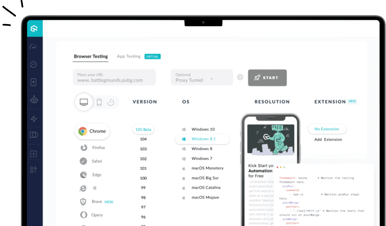
- Lambda Test: LambdaTest is an AI-powered test orchestration and execution platform that lets you run manual and automated tests at scale with over 3000+ real devices, browsers, and OS combinations. Built to guarantee browser compatibility used for websites and web applications. Its functionalities enable developers and testers to run automated in multiple browsers, devices, and operating systems. It offers real-time testing, parallel testing, automated screenshots, and integrations with popular tools.
Users can also engage in live interactive testing within real browser environments. Thus, LambdaTest enables testing websites or mobile apps across various platforms, including Windows, macOS, Android, and iOS, encompassing legacy and the latest desktop and mobile browsers.
- CrossBrowserTesting: Offers a cloud-based web application testing and functional verification service in real-time environments. It also features visual testing capabilities.
Open-Source Solutions:
- Selenium: Framework for automated web browser testing. It requires code writing, offers excellent customization, and works well with various programming languages. Selenium WebDriver enables testing across different browsers.
- Playwright: A modern end-to-end testing framework focusing on speed and ease of use. It supports multiple browsers and provides a record-and-playback feature for creating tests.
- Puppeteer: A Node.js library developed by Google for controlling headless Chrome or Chromium. It’s suitable for creating automated browser tests and scraping web content.
- Cypress: Offers a JavaScript-based API and integrates tightly with the browser’s DevTools for easier debugging and test creation.
Additional Considerations:
- Visual Testing Tools: Services like Applitools and Percy.io can be integrated with cross-browser testing tools to ensure consistent visual rendering across browsers.
- Browser Extensions: BrowserShots or GhostLab can be used for quick cross-browser screenshot comparisons.
Additional Tools for Ensuring Browser Compatibility
Here are some other valuable tools for ensuring browser compatibility:
Performance Testing Tools
- Lighthouse: An open-source tool by Google integrated with Chrome DevTools that assesses performance, accessibility, best practices, SEO, and Progressive Web App criteria. It helps developers identify and fix performance-related issues that can affect compatibility.
- WebPageTest: A performance testing tool that will provide a detailed analysis of the page’s load times, the requests made to resources, and other essential metrics.
Accessibility Testing Tools
- axe DevTools: An accessibility testing tool that integrates with popular development environments to detect accessibility issues in web applications. Ensuring browser compatibility also means providing accessible experiences across different browsers.
- Web Accessibility Evaluation Tool: A tool that evaluates web pages for accessibility issues and provides visual feedback. It can help ensure that browser compatibility does not impact accessibility.
Device Emulators and Simulators
- Chrome DevTools: Offers built-in device emulation to test websites on different devices and screen sizes without leaving the browser. It helps ensure responsiveness and compatibility across devices.
- Xcode and Android Studio: Provide simulators for iOS and Android devices to test web applications in mobile environments without physical devices.
Conclusion
In this blog, we discussed the strategies and tools used to ensure browser compatibility. Strategies like normalizing or resetting CSS, vendor prefixes, etc, can help you build compatible software applications across all browsers. You can opt for a cloud-based platform for testing such software applications as it gives access to a large farm of browsers and versions.
With these advanced strategies and tools, you can ensure your web applications deliver a consistent experience. This approach helps developers to build reliable web applications that meet the demands of a diverse user base.


